I can't believe I'm reviewing this planner! I finally decided to collect stickers just for this planner. It was a actually a hard decision because I'm also considering to get a Belle De Jour 2013 planner. After weeks of contemplating the corporate girl in me won.
I have to thank my dear friend, Sara, for still loving me after all the harassment she got from me just so I have someone to be with every time I want to go to the nearest Starbucks coffee shop in our office (plus I double the stickers when I'm with her hahaha). She even gave me three stickers as one of her Christmas gifts. Today is the last day for claiming your Starbucks 2013 planner and if you've got one more sticker left then you got to stop whatever you're doing and get that last coffee! LOL.
I got mine last week. I got the white one but I was really intending to get the black planner. Unfortunately, they ran out of the black one and I don't want to wait one more week for my planner so I said yes when the barista offered the only color he has - white.
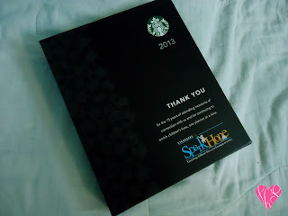
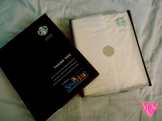
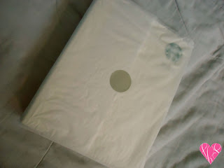
I personally like how it was packaged. The black box and the simple format makes it look so sophisticated. Upon opening the box, your planner is wrapped in a white Japanese paper with a round sticker so the soft paper won't go anywhere. I say, "Sassy!"
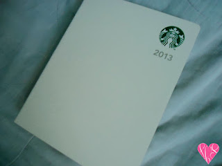
I love the detail of the hard cover. There's a logo of Starbucks on the upper right corner of the planner and under it was the year, where you should use your planner (if you're planning to use it). It looks so simple and I like it that way. Simple and straight. There's also a design embossed on the left side of the planner. It adds texture to the planner's cover.
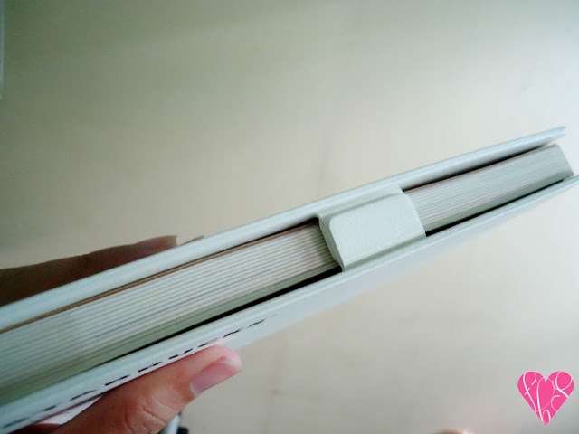
I personally think that these magnets are so cool. Since I'm an OC person, I don't want my planner (notebooks and books as well) to have folds. I hate seeing some crease in my planner and the cover really rocks! Now I don't have to worry about it. It somehow protects the paper inside as well. All I need is one snap and I'm good to go!
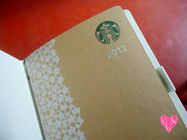
The first page has the "obvious" design of your planner's cover. I really don't know why they have this but I guess it's for beauty's sake :P
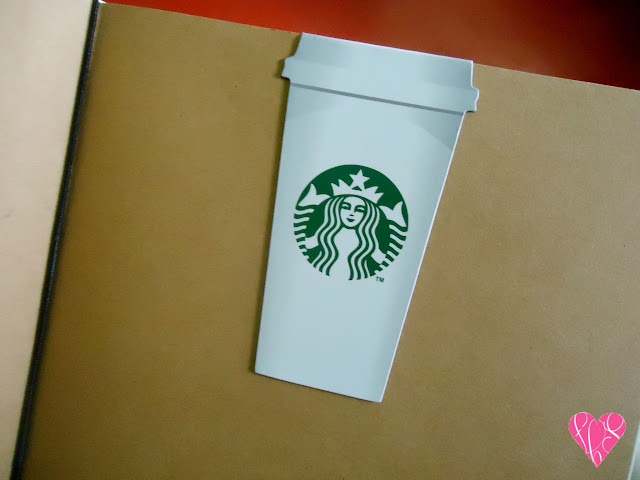
Honestly, I drowned myself with Starbucks frappucino just for this magnetic bookmark. Teehee! I love the idea! I can use this in my other books especially my blog notebook but I have to wait for 2014 for that :P.
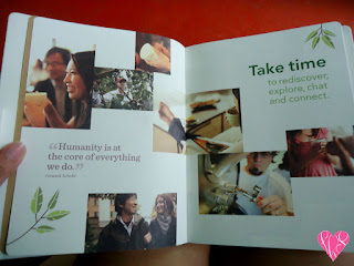
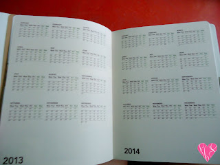
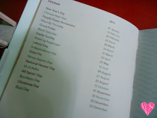
On to the content! As what other planners have, Starbucks 2013 planner has its week-by-week pages and 2013 in a bird's eye view. I've been using US planners since college so I really appreciate the local holidays printed in my Starbucks 2013 planner. You know? Stalking long weekends? LOL
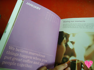
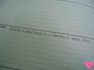
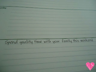
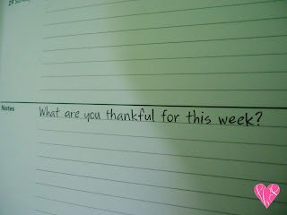
As much as I want to feel deprived of some spaces, I feel it's so thoughtful of Starbucks to put some "reminders" in some dates in my planner. At least, I'll be reminded of some things to be thankful for in my life.
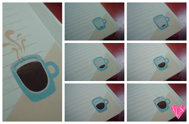

I also find these cups of coffee cute :). You'll observe the as you go toward the end of the year, your cup is getting filled with coffee! Brilliant idea!
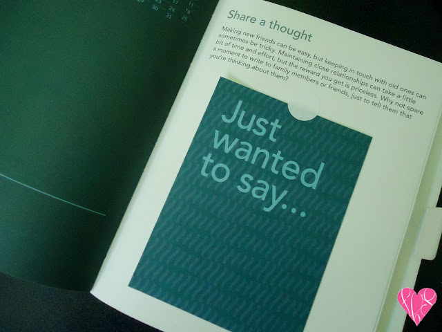
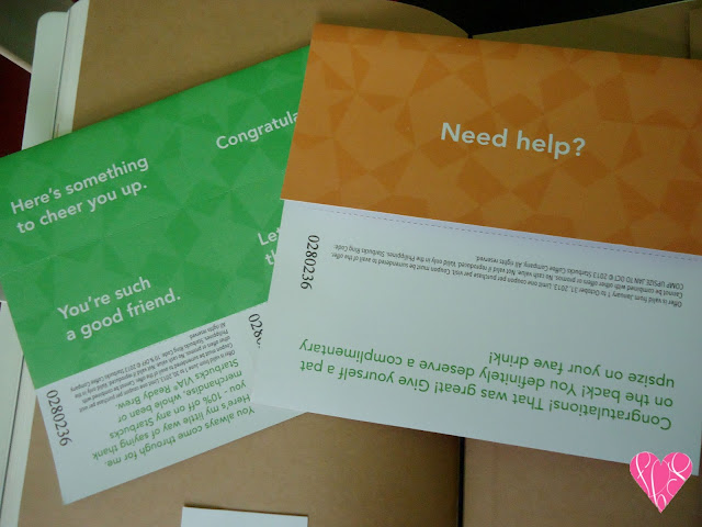
Aside from the free bookmark, free reminders, you also get a free postcard and some GCs! Yay! This is definitely worth all the effort!
Of course, this post will not be complete without photos with my Starbucks buddy, Sara!
*Drum rolls*

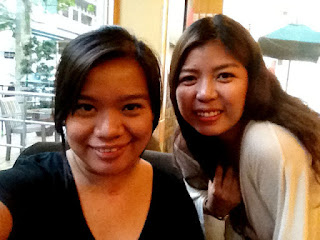
Photo by Sara
Like my review? Let me know by commenting below.
Do you have this planner too? What do you like most about it?
Follow me!

No comments:
Post a Comment